

There's a specific moment every quarter where the whole thing falls apart. Leadership sits in a room, a slide deck loads with 40 metrics across 12 initiatives, everyone nods at the green cells, someone asks a pointed question about the one red cell, and then the meeting ends without a single funding or staffing decision actually changing. Same money, same people, same priorities. The dashboard technically did its job — it displayed status — and completely failed in the sense that matters.
That's the gap this article is about. Not observability as reporting, but observability as something that actually converts signals into resource reallocation. If your portfolio dashboard can't tell you which team to defund next month or where to move two engineers this week, it's decoration.
Why portfolio dashboards drift into decoration
The drift happens for a predictable reason: dashboards get built by people who want to be comprehensive, and comprehensiveness is the enemy of decisiveness.
When a portfolio observability dashboard tries to represent everything — velocity, burndown, budget consumed, headcount, satisfaction scores, defect counts, cycle time, on and on — it stops being readable at a glance. A signal you have to interpret is a signal you'll argue about. In real operations, this is exactly where the wrong incentive kicks in: whoever is behind on their initiative has more to gain from a metric being ambiguous than from it being clear. Ambiguity is where budget gets protected.
The second failure is that most dashboards measure activity, not outcomes. Story points completed, tickets closed, sprints shipped — none of that tells you whether the initiative is bending toward the result it was funded to produce. A team can be extremely busy on a portfolio line item that stopped mattering two quarters ago, and a purely activity-based view will show that team as healthy right up until someone finally asks what it's actually delivering.
The third, quieter failure: dashboards rarely encode load. Two initiatives can look identical on progress while one is quietly consuming enormous maintenance and firefighting effort that never shows up as visible work. That hidden load is where staffing decisions go wrong — you keep feeding people into a line item that's technically "on track" but structurally underwater.
The minimal signal set: three things, not thirty
After stripping down a lot of overbuilt portfolio views, the version that consistently drives decisions comes down to three signal families. Not three metrics — three families, each one boiled to a single headline number.
Stop losing track of your priorities.
Workyly helps you organize, assign, and track every task efficiently.
- Centralized task management
- Real-time collaboration
- Intelligent workflow automation
No credit card required
1. Outcome velocity. Not activity velocity. This is the rate at which an initiative is closing the distance to its defined outcome. If the goal is "reduce onboarding time from 14 days to 3," outcome velocity tracks the movement on that specific number over time — not how many tickets the team burned to get there. The insight most teams miss: outcome velocity should be measured against a target date, so it reads as "on pace / behind pace / stalled," not as a raw trend line nobody calibrates against anything.
2. Maintenance load. The share of an initiative's capacity being spent keeping existing things alive versus building toward a new outcome. This is the single most underweighted portfolio signal. An initiative sitting at 70% maintenance load is not a growth investment anymore — it's life support wearing a growth badge. If you've ever wondered why an initiative feels perpetually stuck, this number usually explains it, and it connects directly to how you'd approach risk-scored technical-debt paydown before the load eats the whole team.
3. Risk heatmap. A small, bounded set of risk categories — dependency, staffing, technical, external — each scored low/medium/high. The heatmap isn't there to be precise. It's there to make risk visible at the portfolio level so a green outcome-velocity initiative with three high-risk cells doesn't get treated the same as a clean one.
Here's the whole thing on one page:
| Initiative | Outcome velocity | Maintenance load | Risk (dep/staff/tech/ext) | Signal |
|---|---|---|---|---|
| Onboarding revamp | On pace | 25% | L / L / M / L | Fund / hold |
| Billing migration | Behind pace | 60% | H / M / H / L | Review |
| Partner API | Stalled | 40% | M / H / M / H | Intervene |
| Reporting suite | On pace | 80% | L / L / H / L | Reclassify |
The "Reporting suite" row is the interesting one. On outcome velocity alone it looks fine. But 80% maintenance load means it's not really a portfolio investment — it's an operations cost pretending to be a project. That reclassification decision never happens on a normal activity dashboard because activity dashboards don't surface load.
What the dashboard should actually look like
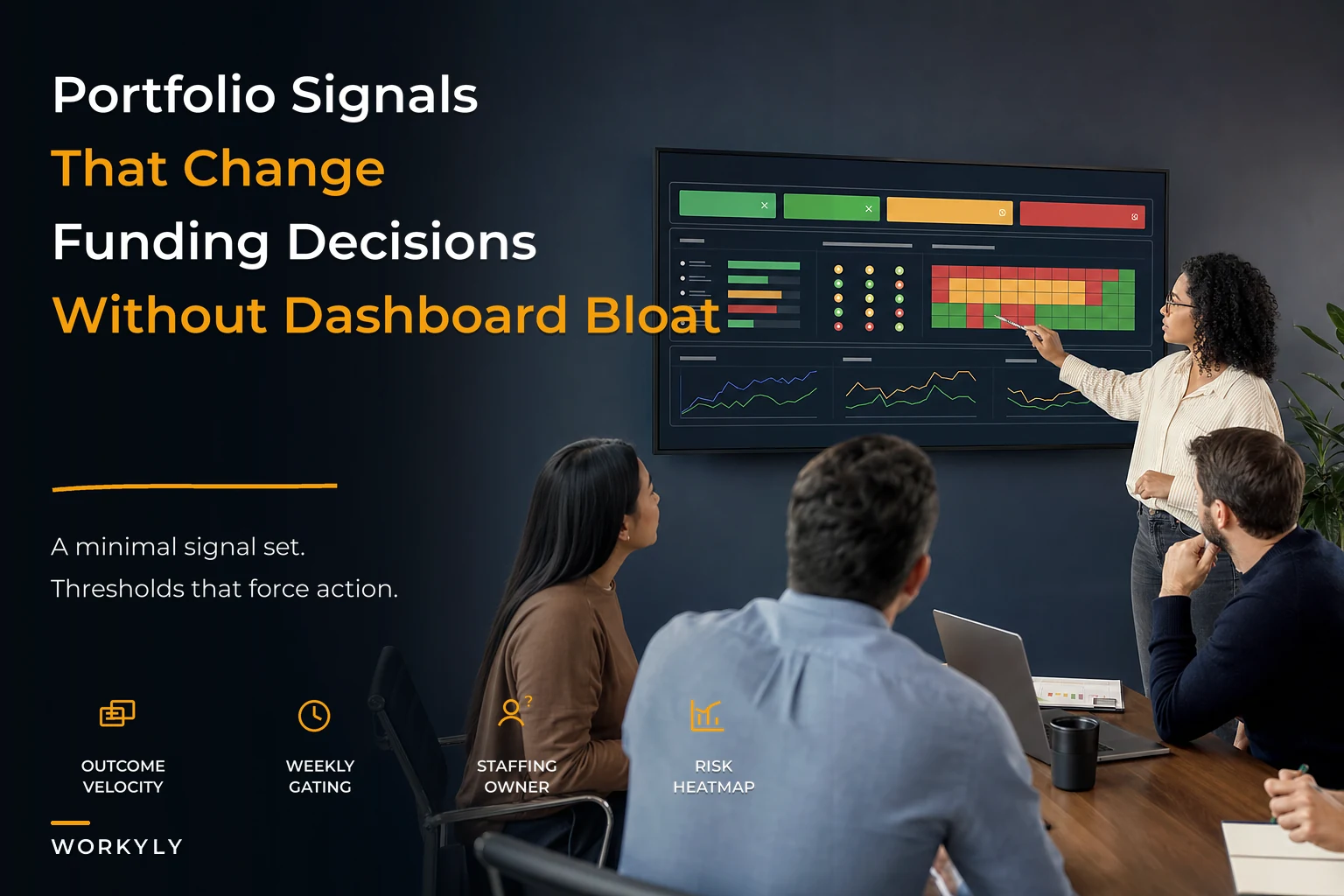
Wireframe it in your head as three stacked bands, top to bottom, in priority order.
Top band — the decision strip. One row per initiative. Just the signal column: Fund, Hold, Review, Intervene, Reclassify. Nothing else. This is the part leadership reads first and the part that drives the meeting. If someone can only look at one thing for ten seconds, this is it.
Middle band — the three signals. Outcome velocity, maintenance load, and the risk heatmap cells, side by side per initiative. This is the "why" behind the top band. When someone challenges a Review flag, you drop into this band — not into a separate report.
Bottom band — the trend context. The last 6–8 weeks of outcome velocity as a sparkline, and the maintenance-load direction (rising/flat/falling). This exists to answer one question: is this getting better or worse on its own? A "behind pace" initiative with rising velocity is a very different decision than one that's been flat for two months.
A simple visual of the bands and the gating flow helps teams align quickly.
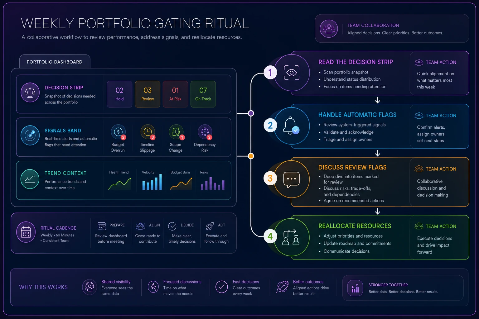
Notice what's not on here: budget-consumed percentages, story point charts, individual ticket status, satisfaction surveys. Those live in the initiative's own workspace. The portfolio view is deliberately blind to them, because the second you add them back, the decision strip loses its authority. The whole point is that it aggregates upward into decisions — and it can only do that if you resist pulling detail back up.
Explicit decision thresholds
A signal without a threshold is just an opinion. What makes this work is that each signal maps to a pre-agreed action, decided when everyone is calm, not during the meeting when someone's budget is on the line.
Here's a workable threshold set. Adjust the numbers to your context, but commit to them in advance:
-
Outcome velocity stalled for 2+ review cycles → automatic Intervene flag. Either re-scope the outcome or pause funding. No third option.
-
Maintenance load crosses 60% → Review flag. Initiative must either get a paydown allocation or be reclassified as operations.
-
Maintenance load crosses 75% → automatic Reclassify. It's no longer a portfolio investment.
-
Two or more High-risk cells → Review, regardless of velocity. Green velocity does not buy you out of a risk conversation.
-
On pace + maintenance under 40% + no High cells → Fund/Hold, and importantly, protected from re-litigation until the next cycle. Healthy initiatives shouldn't have to defend themselves every week.
That last point matters more than people expect. If your gating ritual only ever scrutinizes the troubled initiatives, you create an incentive to look troubled enough to get attention but not troubled enough to get cut. Explicitly protecting the healthy rows removes that game.
The weekly gating ritual that turns signals into money and people
Thresholds don't enforce themselves. You need a short, boring, repeatable ritual — and boring is the goal, because drama means the process isn't trusted yet.
-
Load the decision strip. Read only the signal column. No presentations, no narration from initiative owners yet.
-
Handle the automatic flags first. Anything that crossed a hard threshold gets its predetermined action applied immediately. These aren't debated — they were decided when the threshold was set. This is the step most teams skip, and skipping it is why dashboards drift into decoration.
-
Discuss the Review flags. These are the genuine judgment calls. The owner gets two minutes on the middle-band signals, then the group decides: allocate, reclassify, or intervene.
-
Reallocate against the calls. This is the step that makes it real. If an initiative got Intervened, where do its people go this week? If one got extra funding, what's the source? The meeting doesn't end until reallocation is named.
-
Log the decision. One line per change
what moved, why, and the threshold that triggered it. This log is what protects you next quarter when someone claims the cut was arbitrary.
Step 4 is where most of the value lives, and it's also where teams consistently stall because there's no clean mechanism to actually move capacity between initiatives. If you keep hitting "we agreed to move two engineers but there's no clean way to do it," that's a structural gap — and a credit-based capacity marketplace is one of the cleaner ways to make portfolio-level reallocation a routine transaction instead of a political negotiation every time.
A real scenario: when the load number changed the funding
A mid-sized product org — roughly 60 people across five initiatives — ran a fairly standard portfolio review built almost entirely on activity velocity. Everything looked broadly green most quarters. The problem they couldn't explain: two initiatives kept requesting more headcount every cycle and never seemed to catch up.
When they added maintenance load to the view, the picture snapped into focus. One of those initiatives was sitting at around 70% maintenance load. It wasn't behind because it was underfunded — it was behind because most of its capacity was going to keeping fragile existing work alive. Adding people to it would have just added more surface area to maintain.
The gating ritual forced the reclassify decision that had been avoided for months. They pulled the initiative out of the growth portfolio, put a bounded paydown allocation against the worst of the load, and redirected the two engineers who would have been hired into that mess toward an initiative that was actually on pace and starved for capacity.
The shift over the following couple of quarters wasn't dramatic in headline terms. Outcome velocity on the redirected initiative improved noticeably, and the reclassified one stabilized once it stopped pretending to be a growth bet. The bigger change was that the quarterly funding conversation went from "everyone argues for more" to "the signals told us where to move." That's the whole game.
When this makes sense — and when it doesn't
This earns its keep once you've got roughly five or more initiatives competing for the same pool of money and people. Below that, you can hold the whole picture in your head and a formal gating ritual is just overhead.
When it's genuinely a bad idea: if your outcomes aren't defined well enough to measure velocity against. If half your initiatives have goals like "improve the platform," there's no target to measure pace toward, and the dashboard will just launder vague activity into false confidence. Fix the outcome definitions first. Tying signals to real delivery indicators is a prerequisite, and if that layer's shaky, start with flow metrics that actually predict delivery before building the portfolio view on top.
Who should not do this: teams where the gating meeting won't actually have funding authority in the room. If the people looking at the decision strip can't move money or people, you've built a very elegant status report and you're back where you started. The ritual only works when the attendees can act on step 4 the same day.
Where the tooling quietly helps
None of this requires special software to start. A spreadsheet with three signal columns and a recurring 30-minute meeting will get you most of the value. The place where manual breaks down is keeping the signals current. Outcome velocity and maintenance load only stay honest if they're refreshed from real work data, and manually re-tallying where every team's hours actually go is exactly the chore that quietly stops happening after a few weeks.
That's the narrow spot where AI-assisted operational platforms earn their place — pulling maintenance-versus-build signals from your existing work tracking, flagging when an initiative crosses a threshold before the meeting instead of during it, and keeping the decision log linked to the actual reallocations. Not to make the decision for you. To make sure the numbers on the strip are true when you sit down to decide.
The point
A portfolio dashboard's job isn't to describe your work. It's to force a small number of resourcing decisions on a regular cadence, using signals nobody can argue their way around. Three signal families, explicit thresholds set in advance, and a short weekly ritual where those thresholds actually move money and people — that's the difference between observability that reports the past and observability that changes what gets funded next.
Start by cutting your current dashboard down to the decision strip. If leadership can't make a funding call from it in ten minutes, you haven't built observability yet. You've built a slide.
Ready to boost your team's productivity?
Join 5,000+ teams using Workyly to streamline workflows, improve communication, and deliver projects faster.