


Most organizations don't have a measurement problem at the team level. Teams usually have more data than they know what to do with — cycle time, throughput, WIP, aging work, defect rates. The problem shows up two or three levels up, when a VP asks "are we on track?" and the honest answer is a shrug backed by a slide deck that nobody trusts.
The gap isn't missing metrics. It's missing translation. A team's cycle time of 9 days means nothing to a portfolio gate on its own. An executive doesn't fund "95th percentile cycle time." They fund outcomes, confidence, and risk-adjusted bets. Somewhere between the team board and the quarterly funding review, the signal has to be converted — and in most companies that conversion is done by hand, badly, in a spreadsheet, the night before the meeting.
This article is about the wiring: which team-level flow metrics actually feed portfolio gates, how to translate them without losing meaning, and what thresholds should trigger funding actions. Less a dashboard tutorial, more the plumbing diagram behind one.
Why the translation layer is where everything breaks
Across a lot of organizations, the pattern looks like this. Teams measure flow. Executives measure money and outcomes. Nobody owns the layer in between — the portfolio layer that's supposed to turn one into the other.
-
Averaging hides the tail. A portfolio where four teams ship in 5 days and one team is stuck at 40 looks "fine on average." The 40-day team is the one about to blow the quarter.
-
Status becomes political. When there's no rule connecting a metric to a color, "green" means "I don't want questions this week." Programs stay green until the week they slip, then jump straight to red.
-
The signal arrives too late to act on. Flow metrics are leading indicators. Rolled up monthly and hand-massaged, they become lagging indicators — useful for explaining the miss, useless for preventing it.
The deeper issue is that each level speaks a different language. Teams speak in flow. Portfolios speak in delivery confidence and dependency risk. Executives speak in outcomes, cost of delay, and capital allocation. A cross-level metrics architecture is really just a set of agreed-upon translation rules between those three languages, plus the thresholds that decide what each translated number does.
If you've already set up solid team-level instrumentation — the kind covered in our piece on team flow metrics that predict delivery — you have the raw inputs. This is about what happens to those inputs after they leave the team.
The three layers and what actually flows between them
Before any dashboard, you need to be clear on what lives at each level and what crosses the boundary. Not every team metric should travel upward. Most shouldn't. The whole point of a layer boundary is that it filters and transforms.
Stop losing track of your priorities.
Workyly helps you organize, assign, and track every task efficiently.
- Centralized task management
- Real-time collaboration
- Intelligent workflow automation
No credit card required
Layer 1 — Team flow (the raw signal)
-
Cycle time distribution (not the average — the 50th, 85th, 95th percentiles)
-
Throughput per week
-
WIP and WIP aging
-
Flow efficiency (active time vs. wait time)
-
Blocked-item count and blocked duration
These update daily and belong to the team. They are diagnostic. An executive should almost never look at them directly.
Layer 2 — Portfolio gate (the translated signal)
-
Forecast confidence (probability of hitting the committed date, derived from cycle-time distributions, not from a single estimate)
-
Dependency health (how many cross-team blockers, how long they've aged)
-
Flow debt trend (is aging WIP accumulating or draining?)
-
Scope-vs-capacity ratio
This is the layer everyone skips, and it's the one that matters most. Here, team flow data gets converted into delivery confidence and risk posture for a funded initiative. The portfolio layer answers: given what the contributing teams are doing, how likely is this bet to deliver its outcome, and what's threatening it?
Layer 3 — Executive KPI (the decision signal)
-
Outcome progress against the thesis (leading outcome indicators, not output counts)
-
Cost of delay exposure across the portfolio
-
Risk-adjusted delivery confidence for the quarter
-
Capital efficiency — outcome per unit of invested capacity
At the top, almost nothing is about process. It's about whether to keep funding something, redirect it, or kill it. The metrics are outcome- and money-shaped:
The art is the mapping between these. A clean architecture makes the lineage explicit: this executive KPI is computed from these portfolio signals, which are computed from these team flow metrics. When a VP asks "why is confidence yellow?" you can walk the wire all the way down to the two teams with aging blockers.
The wiring diagram (in words)
Since you can't see a drawn diagram here, here's the wire described as a flow you can sketch on a whiteboard:
``
Team cycle-time distribution → percentile projection or Monte Carlo → Initiative forecast confidence → Portfolio delivery-confidence band → Executive risk-adjusted quarter KPI
``
``
Team blocked-duration + cross-team dependency count → Dependency health score → Portfolio risk posture → Executive cost-of-delay exposure
``
``
Team throughput + WIP → Scope-vs-capacity ratio → Portfolio over-commitment flag → Executive capital-efficiency view
``
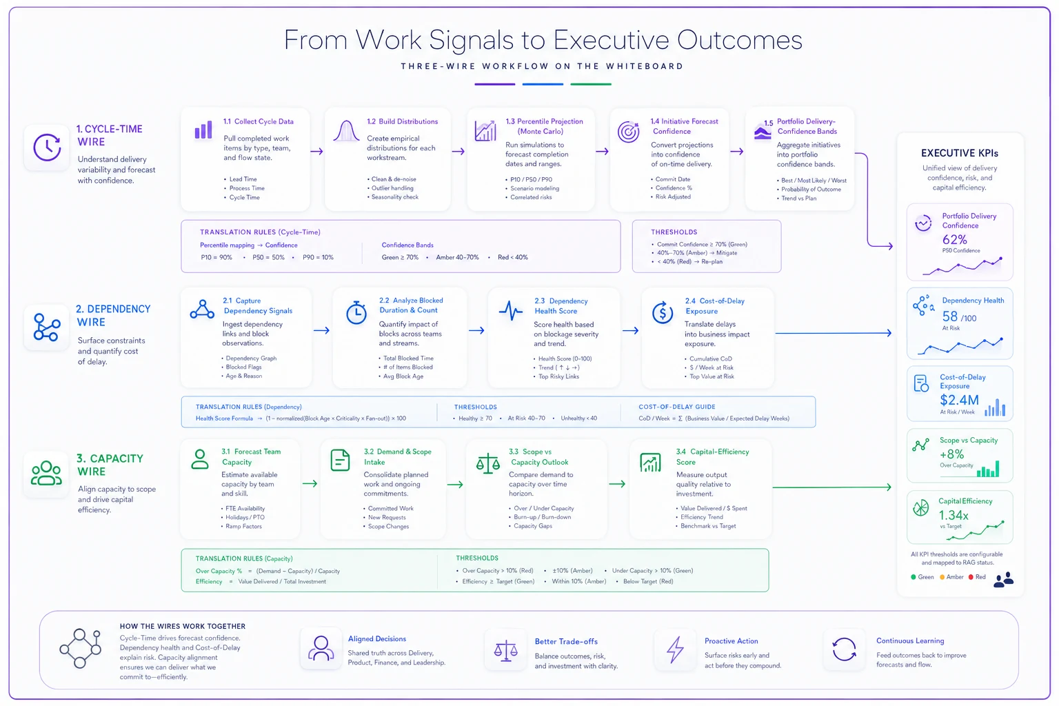
This sketch highlights the three primary wires: confidence, risk, and capacity.
Three wires. That's it. Most organizations try to pipe fifteen metrics upward and drown the signal. If you can only maintain three translation rules, maintain these three: confidence, risk, and capacity. Everything else is diagnostic detail that stays at the layer where it's useful.
Translation rules: the actual conversion logic
A translation rule is a defined, boring, repeatable operation. No judgment, no vibes. Here's the kind of specificity you need for each wire.
| Team metric (Layer 1) | Translation rule | Portfolio signal (Layer 2) | Executive KPI input (Layer 3) |
|---|---|---|---|
| 85th-percentile cycle time + remaining backlog | Monte Carlo projection to committed date | Forecast confidence % | Risk-adjusted delivery confidence |
| Blocked duration (sum, by dependency) | Score ≥5 days aged = 1 risk point per blocker | Dependency health (0–10) | Cost-of-delay exposure |
| Throughput vs. committed scope | Scope points ÷ 6-week rolling throughput | Capacity ratio (>1.2 = over-committed) | Capital-efficiency flag |
| WIP aging slope (week-over-week) | Positive slope 3+ weeks = flow-debt accumulating | Flow-debt trend (improving/flat/worsening) | Delivery-risk narrative |
Two things worth noting. First, averages barely appear — distributions and tails do the work, because the tail is where delivery dies. Second, each rule produces a bounded, comparable output. A dependency health score of 3 means the same thing across every initiative. That comparability is what lets an executive scan a portfolio instead of reading twelve bespoke status paragraphs.
The mistake most people make here is inventing a new translation rule per team to be "fair" to each team's context. Don't. Context belongs at Layer 1 where it's diagnosed. The entire value of the portfolio layer is standardization. If every initiative computes confidence differently, you can't compare bets — and comparing bets is the entire job of a portfolio.
Decision thresholds and funding-action recipes
Translated metrics are inert until a threshold turns them into an action. This is the part most dashboards never finish. They show status and stop. A real cross-level architecture attaches a recipe to each band — a pre-agreed action, so the meeting isn't a debate about what the number means but a confirmation of what the number triggers.
-
Confidence ≥ 80%, dependency health ≤ 2, capacity ratio ≤ 1.0 → Continue funding as-is. No review action. Reconfirm next gate.
-
Confidence 60–79%, or one worsening signal → Fund with a named mitigation. Assign an owner to the weakest wire, re-measure in two weeks. Funding unchanged but conditional.
-
Confidence 40–59%, or two worsening signals → Hold incremental funding. No new scope added. Release remaining funds only after the mitigation shows movement in the next cadence.
-
Confidence < 40%, or dependency health ≥ 7 → Trigger a funding decision review. Options on the table: re-scope, re-staff, or stop. The default is not "keep going."
Attach a concrete timing to each recipe (e.g., re-measure in two weeks) so the action becomes a measurable cadence, not a vague promise.
The recipe approach removes the single most expensive dynamic in portfolio reviews — the slow slide. Without thresholds, an initiative at 45% confidence gets "one more quarter" four quarters in a row because nobody wants to be the person to pull it. With a threshold, 45% automatically puts the stop/re-scope conversation on the agenda. The system makes the hard conversation routine instead of personal.
The dashboard-and-threshold side of this is covered in more depth in portfolio observability that actually drives funding. This article is the layer beneath that — how the signals on that dashboard get manufactured from team data.
A sample dashboard layout for each level
The dashboards should look different at each level, because the audiences do different jobs. A common failure is shipping one dashboard and giving everyone a login — teams drown in portfolio abstractions and executives get buried in WIP charts they can't act on.
Team dashboard (daily use): cycle-time control chart, aging WIP by column, blocked items with age, throughput trend. All diagnostic, all operational. This is where someone decides what to unblock today.
Portfolio dashboard (weekly/biweekly): one row per initiative, four columns — forecast confidence, dependency health, capacity ratio, flow-debt trend — each in its band color, each clickable down to the contributing teams. No raw cycle times. The program manager uses this to decide where to spend attention.
Executive dashboard (gate cadence): the whole portfolio as a grid — outcome progress against thesis, risk-adjusted confidence, cost-of-delay exposure, capital efficiency. Each cell carries its recipe (continue / mitigate / hold / review). An exec should be able to make funding decisions off this view in under twenty minutes.
The through-line is that every number on the executive view can be traced, without a translator, down to the team metric that produced it. If someone has to interpret the handoff manually, the architecture isn't finished.
A real scenario: a 40-person software org
A mid-sized product organization — around 40 people across six teams, running roughly eight funded initiatives at any time. Their portfolio reviews were monthly, three hours long, and mostly argument. Status colors were assigned by whoever presented. Two initiatives had quietly consumed close to $300k of engineering capacity over two quarters while sitting at "yellow" the entire time, because yellow had no definition and therefore no exit.
They did three things. Defined the three wires (confidence, dependency health, capacity ratio) with fixed translation rules. Set the four threshold bands with recipes. And moved the gate from monthly to biweekly so the leading signals stayed leading.
The first biweekly review after the switch was uncomfortable. Two of the eight initiatives dropped straight into the "funding review" band — confidence under 40%, dependency health above 7 — because the math finally said what everyone privately knew. One got re-scoped down to a single outcome. One got stopped. The capacity that freed up, roughly a team and a half, went to an initiative that had been starved at a 1.3 capacity ratio for weeks.
The honest result after a quarter: review meetings dropped to around 50 minutes, the arguing mostly stopped because the thresholds did the arguing, and forecast confidence across the surviving initiatives became something leadership actually believed. Not a transformation — just decisions getting made on time instead of a quarter late. The stopped initiative alone saved somewhere in the range of $120k–$150k of capacity that would've drained into a yellow box indefinitely.
When this architecture makes sense — and when it doesn't
When it's worth building: You have multiple teams feeding a smaller number of funded initiatives, and you make real allocation decisions at some cadence. The value comes entirely from comparison and from thresholds forcing timely decisions. If you're routinely choosing between bets, the translation layer pays for itself fast.
When it's a bad idea: If you have one team and one product, this is overhead. You don't need a portfolio layer to translate a team to itself — just use the team dashboard and talk to each other. Building three dashboards and a threshold matrix for a single team is ceremony, not signal.
Who should NOT do this yet: Organizations whose team-level data isn't trustworthy. Translation amplifies whatever you feed it. If cycle times are wrong because people don't move cards consistently, your executive confidence number will be confidently wrong — which is worse than no number. Fix instrumentation integrity first. The same discipline applies to how decisions get recorded against these thresholds — if you want those funding calls to stay traceable and reviewable later, our write-up on decision hygiene at scale covers linking decision records to funding and rollback triggers.
The translation layer needs an owner. Without one, the rules drift, teams start reporting in their own dialects again, and within two quarters you're back to hand-colored spreadsheets the night before the review.
A short checklist before you wire it up
Use this checklist to validate readiness before you wire the translation layer into your funding gates.
-
- [ ] Team-level flow data is consistent enough to trust (cards move when work moves)
-
- [ ] You've chosen three translation wires — not fifteen — and written the exact conversion rule for each
-
- [ ] Each portfolio signal produces a bounded, comparable output (same meaning across initiatives)
-
- [ ] Every executive KPI has traceable lineage down to a team metric
-
- [ ] Each threshold band has a pre-agreed funding recipe, including a real "stop" option
-
- [ ] The gate cadence is frequent enough that leading signals stay leading
-
- [ ] Someone owns the translation layer itself (not the teams, not the exec — a named portfolio role)
That last point is the one organizations skip and then wonder why the whole thing decays. The translation layer needs an owner.
Without one, the rules drift, teams start reporting in their own dialects again, and within two quarters you're back to hand-colored spreadsheets the night before the review.
The point of all this
A cross-level metrics architecture isn't a reporting upgrade. It's a decision system. The dashboards are just where the decisions become visible. What actually changes is that flow data stops dying in the gap between the team board and the funding meeting — it travels up through defined translation rules, lands in a threshold, and produces an action.
The tooling to automate the aggregation and keep the lineage honest matters, and plenty of platforms can roll team signals into portfolio views without the nightly spreadsheet ritual. But tooling is downstream of the thinking. Get the three wires, the translation rules, and the threshold recipes right on paper first. If the logic is sound, almost any system can carry it. If the logic is vague, no dashboard will save you — it'll just make the vagueness render faster.
A cross-level metrics architecture isn't a reporting upgrade. It's a decision system. The dashboards are just where the decisions become visible. What actually changes is that flow data stops dying in the gap between the team board and the funding meeting — it travels up through defined translation rules, lands in a threshold, and produces an action.
The tooling to automate the aggregation and keep the lineage honest matters, and plenty of platforms can roll team signals into portfolio views without the nightly spreadsheet ritual. But tooling is downstream of the thinking. Get the three wires, the translation rules, and the threshold recipes right on paper first. If the logic is sound, almost any system can carry it. If the logic is vague, no dashboard will save you — it'll just make the vagueness render faster.
Ready to boost your team's productivity?
Join 5,000+ teams using Workyly to streamline workflows, improve communication, and deliver projects faster.